User:Agryson: Difference between revisions
No edit summary |
|||
| Line 36: | Line 36: | ||
{| class="wikitable" |
{| class="wikitable" |
||
|- |
|- |
||
|style="width: 25%;| |
|||
Why limit myself to these colors? |
|||
|Restricting the colors to a defined palette helps avoid heterogeneous iconography and improves readability when there are many icons. |
|Restricting the colors to a defined palette helps avoid heterogeneous iconography and improves readability when there are many icons. |
||
|} |
|} |
||
| Line 50: | Line 51: | ||
{| class="wikitable" |
{| class="wikitable" |
||
|- |
|- |
||
|style="width: 25%;| |
|||
Why use this grid and stroke size? |
|||
|For historical reasons, FreeCAD uses a 64px icon that then gets scaled down. Not ideal, but it adds character. As a result, keeping things aligned to a power of two grid with thicknesses that are powers of two helps to avoid or at least mitigate anti-aliasing issues upon rescaling. |
|For historical reasons, FreeCAD uses a 64px icon that then gets scaled down. Not ideal, but it adds character. As a result, keeping things aligned to a power of two grid with thicknesses that are powers of two helps to avoid or at least mitigate anti-aliasing issues upon rescaling. |
||
|} |
|} |
||
| Line 60: | Line 62: | ||
{| class="wikitable" |
{| class="wikitable" |
||
|- |
|- |
||
|style="width: 25%;| |
|||
Why is the outline needed? |
|||
|The outline is the skeleton on which everything else hangs by adding form contrast. Using the |
|The outline is the skeleton on which everything else hangs by adding form contrast. Using the Outline color or the dark color depends on the situation, but without this line, the range of backgrounds on which the icon is visible gets drastically limited |
||
|} |
|} |
||
| Line 70: | Line 73: | ||
{| class="wikitable" |
{| class="wikitable" |
||
|- |
|- |
||
|style="width: 25%;| |
|||
Why use the highlight? |
|||
|The highlight works in unison with the outline to improve form contrast - especially on dark backgrounds. It is never a bad idea, but if you don't have the space (on a thin line for example) you can opt out of it provided you have ensured enough contrast between the main color and the outline |
|The highlight works in unison with the outline to improve form contrast - especially on dark backgrounds. It is never a bad idea, but if you don't have the space (on a thin line for example) you can opt out of it provided you have ensured enough contrast between the main color and the outline |
||
|} |
|} |
||
===Lighting [Optional]=== |
===Lighting [Optional]=== |
||
As per Tango guidelines, if you're adding a gradient lighting effect, try to make it look like the light is coming from the top left. This is done by adding the highlight color up top left and the Base or |
As per Tango guidelines, if you're adding a gradient lighting effect, try to make it look like the light is coming from the top left. This is done by adding the highlight color up top left and the Base or Dark color bottom right (notice that I haven't played around trying to use a non-palette color) |
||
[[File:Draft_Clone.png|center|Subtle but effective.]] |
[[File:Draft_Clone.png|center|Subtle but effective.]] |
||
{| class="wikitable" |
{| class="wikitable" |
||
|- |
|- |
||
|style="width: 25%;| |
|||
Why use lighting? |
|||
|Lighting is just another way to tie icons together and ensure that there are varying levels of 'value' to improve their readability. Provided the outline and highlight are present though, it can be considered optional |
|Lighting is just another way to tie icons together and ensure that there are varying levels of 'value' to improve their readability. Provided the outline and highlight are present though, it can be considered optional |
||
|} |
|} |
||
Revision as of 11:50, 18 January 2017
Public Notes
Artwork Guidelines
Icon Anatomy
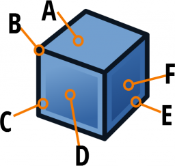
A FreeCAD icon is composed of 6 elements which can be remembered easily using the awkward acronym "SALCHO": Stroke, Alignment, Lighting, Color, Highlighting, Outline
Here's a concrete, yet arbitrary example:

| A | The highlight color is used for this entire surface to indicate light falling from above |
| B | The obligatory dark outline surrounds the icon shape to provide form contrast |
| C | Just inside the outline, the highlight stroke (using the highlight color) provides contrast on dark backgrounds |
| D | This face is primarily the base color, but a light gradient from highlight (top left) to base (bottom right) gives the impression of light falling from above left |
| E | The highlight here is the base color (one tone down) to give the impression of this being the face furthest from the light |
| F | This face is like D but goes from Base (top left) to Dark (bottom right) |
The following sections explain these elements in a more structured way.
Colors [Obligatory]
FreeCAD uses a palette adapted from the Tango palette. Each main color comes in 4 tones: Highlight, Base, Dark and Outline.

|
Why limit myself to these colors? |
Restricting the colors to a defined palette helps avoid heterogeneous iconography and improves readability when there are many icons. |
Grid & Stroke Width [Obligatory]
FreeCAD Icons are 64px*64px nominal size (Though I like to leave a 2px margin all around to prevent funky antialiasing things from happening on the image edge). When creating or editing an icon, make sure your document size is 64 x 64 with the units being px.
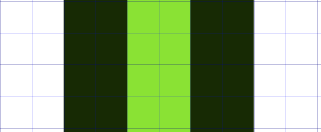
It's also strongly recommended to apply at least one grid to the document that has a grid line every pixel and a major grid line every 2 pixels. Feel free to add other grids to help out, but you should have at least that one. You're strokes would then be aligned along the minor grid intersections. (See image)
Strokes should be no thinner than 2px, with rounded caps and corners in most cases. Strokes can be thicker, but aim for a multiple of two to minimise scaling fuzziness.

|
Why use this grid and stroke size? |
For historical reasons, FreeCAD uses a 64px icon that then gets scaled down. Not ideal, but it adds character. As a result, keeping things aligned to a power of two grid with thicknesses that are powers of two helps to avoid or at least mitigate anti-aliasing issues upon rescaling. |
Outline [Obligatory]
Basing yourself on the main color of the icon, ensure that there is a dark outline (of 2px as mentioned earlier). This works in union with the highlight to ensure good form contrast on multiple background tones.

|
Why is the outline needed? |
The outline is the skeleton on which everything else hangs by adding form contrast. Using the Outline color or the dark color depends on the situation, but without this line, the range of backgrounds on which the icon is visible gets drastically limited |
Highlight [Strongly Advised]
Using the Highlight color, add an internal stroke (again, 2px) to help make that outline pop. On dark backgrounds, it's this highlight that will be providing the form to the icon.

|
Why use the highlight? |
The highlight works in unison with the outline to improve form contrast - especially on dark backgrounds. It is never a bad idea, but if you don't have the space (on a thin line for example) you can opt out of it provided you have ensured enough contrast between the main color and the outline |
Lighting [Optional]
As per Tango guidelines, if you're adding a gradient lighting effect, try to make it look like the light is coming from the top left. This is done by adding the highlight color up top left and the Base or Dark color bottom right (notice that I haven't played around trying to use a non-palette color)

|
Why use lighting? |
Lighting is just another way to tie icons together and ensure that there are varying levels of 'value' to improve their readability. Provided the outline and highlight are present though, it can be considered optional |
That's it - that's all I do to make sure that there's a unified look to all the icons. Remember: SALCHO Stroke, Alignment, Lighting, Color, Highlight, Outline